article
Article heading
The introduction of flexboox and CSS Grids gives developers great tools for laying out web pages.
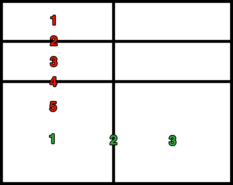
A good way to get an understanding of how CSS Grids works is to see a sketch of a grid with the rows and columns numbered. The red numbers are the rows and the green numbers are the columns.
To create the grid in the sketch you would define the rows and columns something like this.
grid-template-columns: auto 0.5em auto;
grid-template-rows: auto 0.5em auto 0.5em auto;
The columns have three values declared to represent the three green numbers and the rows has five values declared to represent the five red numbers.
To create the multi dimensional layout as shown in the flexbox examples we would have to use the grid-column and grid-row properties.
nav {
    grid-column: 1 / 2;
    grid-row: 1 / span 3;
}
header {
    grid-column: 3 / span 1;
    grid-row: 1 / span 1;
}
aside {
    grid-column: 1 / span 1;
    grid-row: 5 / span 1;
}
article {
    grid-column: 3 / span 1;
    grid-row: 3 / span 3;
}
The introduction of flexboox and CSS Grids gives developers great tools for laying out web pages.
Know your margins from your paddings.
Equal heights :)
Volume 3, now meow's what I call literature

Volume 3, now meow's what I call literature
Know your margins from your paddings.
Volume 3, now meow's what I call literature
Know your margins from your paddings.
Know your margins from your paddings.
Know your margins from your paddings.